design::writings


El Lissitzky
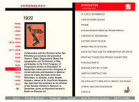 Another flash piece, done by the Getty Museum a few years ago, contains a chronology that showcases the work of El Lissitzky and the highlights of his life. The overall site goes into rich detail about his work and has tons of examples, that popup to larger details. In this particular case, it seems like the site could have been done in HTML just as easily. Nothing that I can see, makes flash a better choice - unlike some of the other museum sites I have commented on in the past.
Technology aside, this is a a great way to get an overview of El Lissitzky and his work and see how it was a product of the times and geography. Lissitzky was a master of communication and information organization. He was skilled across multiple media and his design work feels as fresh and lively today as it was during his life.
Posted by erin at 04:24 PM | in El Lissitzky :: History :: Timelines :: | Link
Wednesday 08|28|02
The Pursuit of Simplicity
Luke Wroblewski talks about the pursuit of simplicity and how that goal affects interface design. He offers insights into why technology and design methodologies sometimes get in the way. Nice thoughts and good advice without being too preachy. He is also the author of a new book Site-seeing: A visual approach to web Usability. which looks pretty interesting.
Posted by erin at 03:48 PM | in Interaction Design :: | Link
Tuesday 08|20|02
Ephemera Now
Check out this collection of ephemera over at Ephemera Now. In addition to large scans of the ads, the site itself is very nicely designed, although the navigation is a little confusing.
From the site:
“EphemeraNow.com is a Web site dedicated to the advertising and illustration art of mid-century America. In addition to offering images for your viewing pleasure, we sell high-quality scans of color illustrations in the public domain, for print, broadcast and Web use, as well as a limited selection of advertising from vintage periodicals (Coke). ”
There seems to be hundreds of really nice quality scans here and the images are not all ads. There are several Fortune Magazine covers as well. I wonder if they are actually making any money selling the scans and how they get away with selling scanned copies of copyrighted work?
Posted by erin at 10:33 AM | in History :: | Link | Comments (4)
Wednesday 08|14|02
Thoughts from Milton Glaser
Some interesting thoughts to ponder over at Metroplis, brought to you by Milton Glaser, one of the old school designers who has been around a while. I like the colored diagram that makes up the article. This is design working to communicate the message. The words alone would have been interesting and meaningful, but the design punches it and brings it home.
He also had some words of wisdom (pdf) to share at the Voice Conference, about what he has learned.
Posted by erin at 09:05 AM | in Graphic Design :: | Link
dezine
The creators of atlas magazine, one of my favorite sites from early in the days of the web, have just published a book. The old atlas issues are back up for your enjoyment. Even today, 4 years after their last issue, they still seem fresh and interesting.
Posted by erin at 07:48 AM | in Graphic Design :: Magazines :: | Link
Tuesday 08|13|02
Small Pieces
We published a review today of "Small Pieces Loosely Joined", by David Weinberger, over on Boxes and Arrows. It's a good summary by Andrew Hinton of a really interesting book about the Web phenomenon. Over on Salon, Scott Rosenberg, compares the thoughts of Weinberger to those of John Motavalli who recently wrote "Bamboozled at the Revolution". The essay is very interesting and looks at the two views of the web revolution.
Posted by erin at 10:57 AM | in Books :: Magazines :: | Link
Who woulda thought...
Microsoft has a typography blog chalk full of interesting links.
...........................................
Also of note: Andy Crewdson, of Lines and Splines has launched a new typography focussed site called New Series. The first issue features an indepth interview with writer Robin Kinross and a review of the reprint of Harry Carter�s A view of early typography: up to about 1600. Both strong pieces. I am looking forward to more from Andy.
Posted by erin at 10:24 AM | in Typography :: | Link
Notes on the Golden Mean
There is a very rich and interesting project that walks through the concepts of the Golden Mean and the ideas of proportion. Robert Charlton puts together the site from selections from "Looking and Seeing 3 - THE SHAPES WE NEED" by Kurt Rowland �1965 (out of publication).
Presented in a small, nicely proportioned window, this is a great primer to understand the ideas of proportion and the base mathematics behind the numbers as well as how these ideas can be seen in nature and how these ideas have been used in architecture
Posted by erin at 09:19 AM | in Theory :: | Link
Monday 08|12|02
A Must Hear
Matt Haughey points me to a really interesting presentation (8mb flash - but really worth the download) given by Lawrence Lessig at OSCON about the nature/history of copyright and technology layered with today's politics. This is definitely some heavy food for thought - especially if you are a creator or user of anything - media, music, books, movies, software etc.
more...
Posted by erin at 04:47 PM | in Sites of Note :: | Link
Tuesday 08| 6|02
Searching for the Perfect Tool
Some thoughts about looking for the perfect tool - and bad mouthing other tools and technologies are collected over at Boxes and Arrows. I have been thinking about this a lot as these discussions ebb and flow on the lists and I am really sick of it. We have so many other, bigger issues to deal with. Let me know what you think - do you agree, disagree or just don't care.
Posted by erin at 05:42 PM | in Information Architecture :: | Link